Technology, Dev Diary
Cardiac King 1.3
Liquid Glass and watchOS Double Tap
Since the release of iOS 26 in September of last year, I’ve updated one of my apps, Cardiac King, to optimize it for the new design, as well as adding enhancements unrelated to the new OS. For those who haven’t used it before, Cardiac King is a poker companion app that displays poker hands and game information. It supports a wide variety of platforms, including iOS, watchOS, and visionOS, as well as macOS via the iPadOS app. In this post, I’d like to share some of the design decisions I’ve made for these updates and my rationale for them. This dev diary will be covering additions from version 1.1 to 1.3.
Liquid Glass
The translucent elephant in the room is Apple’s new design language, Liquid Glass. Despite mixed reviews of the design itself, I am positive of the aesthetic itself. I think it’s a nice hybrid of the pre-iOS 7 skeuomorphic look while maintaining the modern minimalistic aesthetic we’re used to today. It also serves as a testament to the amount of power our devices have today that we can afford to use system resources on things like refraction.
I’m also a big fan of the 2000s-era “gummy” icon look, and Liquid Glass is a step closer to this look with the additional depth given to icons and the playful bounciness of controls. It’s obviously not the same aesthetic, but Apple said they took inspiration from their Aqua user interface from Mac OS X, so I wouldn’t be surprised if this is a modern reinterpretation of it.
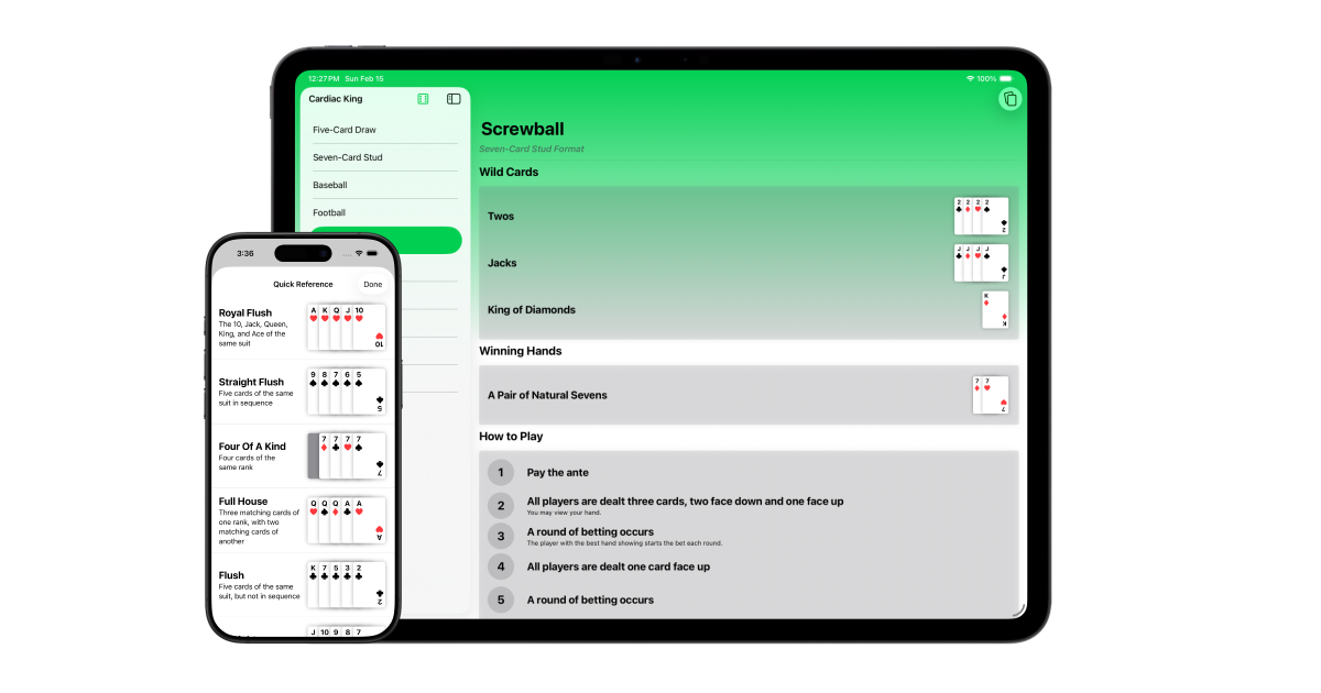
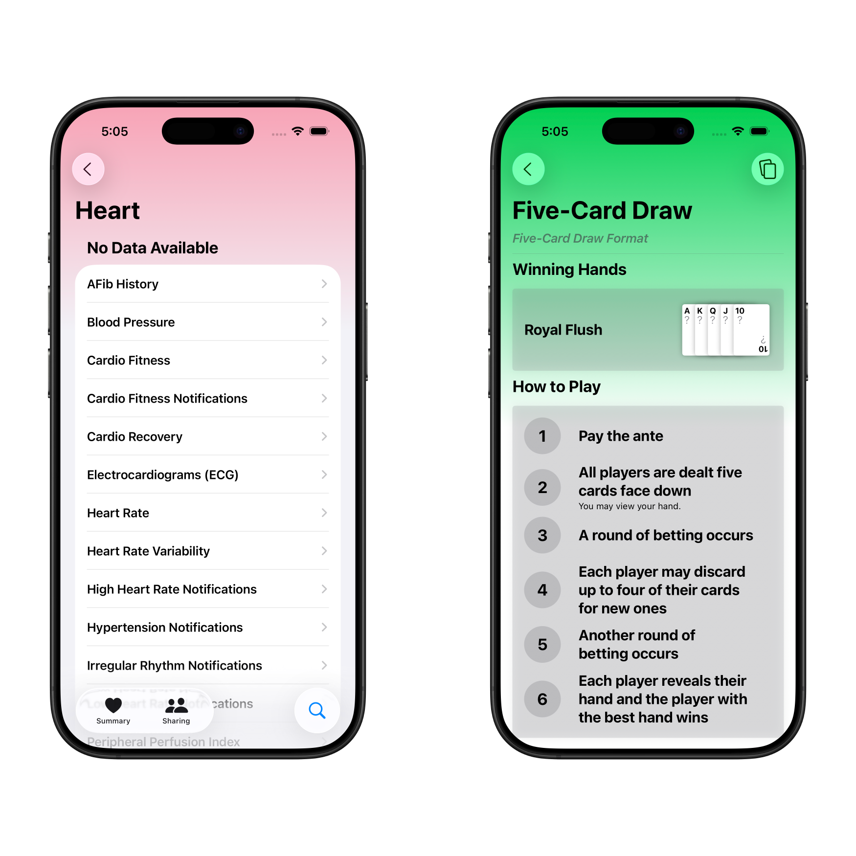
Liquid Glass gave me an opportunity to subtly add some vibrancy to Cardiac King. During my time at WWDC25, Apple design experts mentioned to avoid tinting buttons, which was my first instinct. Instead, they recommended having the background display content, like an image. Cardiac King didn’t have much to offer for visual content. But then I noticed how Apple’s Health app handled this with a gradient. I applied a similar gradient to the game detail view and really liked how such a small change made the view more vibrant and welcoming, while also allowing my toolbar buttons to reflect the color.
I added this gradient to my watchOS app as well to reflect the design language introduced back in watchOS 10. In fact, I’ve abstracted this gradient logic to work across iOS, iPadOS, watchOS, and macOS and made it into a simple one line modifier for SwiftUI views. It even automatically hides itself when Apple Watch is using its Always On Display.
.gradientBackground(color: .accentColor)
It’s available in my SeizosKit package, free to use in any Swift project. It contains a bunch of useful views and modifiers, so please give it a look if you’re into Swift development.
visionOS, despite being the founding platform of Liquid Glass, now feels a bit left behind. While other platforms rely on the content to provide visual impact, visionOS relies on the physical surrounding environment. As a result, visionOS views appear much more subdued compared to those on iOS.
Icon Composer
Apple also introduced a new tool to make icon creation easier. Icon Composer creates a single file for iOS, macOS, and watchOS apps, with Liquid Glass effects and icon variants built in. Previously, I supplied three app icons for iOS: the default icon, the dark icon, and the tinted icon. Now, I only need one file and I can preview and tweak all variants from within it.
The app icon itself was slightly modified to better fit the Liquid Glass look. I removed the subtle felt effect from the green background, as it wasn’t very noticeable to begin with (especially when viewed at icon size). Furthermore, Icon Composer’s native gradients play much nicer with icon variants.
Unfortunately, visionOS isn’t currently supported, but I would be surprised if it isn’t added at WWDC26. Until then, I’ve done my best to have the visionOS icon match its iOS counterpart’s.
I think it would be cool if Apple found a way to integrate Pixelmator with this in the future, as they’ve recently acquired the app. I use Pixelmator to create the designs for all of my app icons, so anything that streamlines that process would be greatly welcomed.
Assistive Technologies
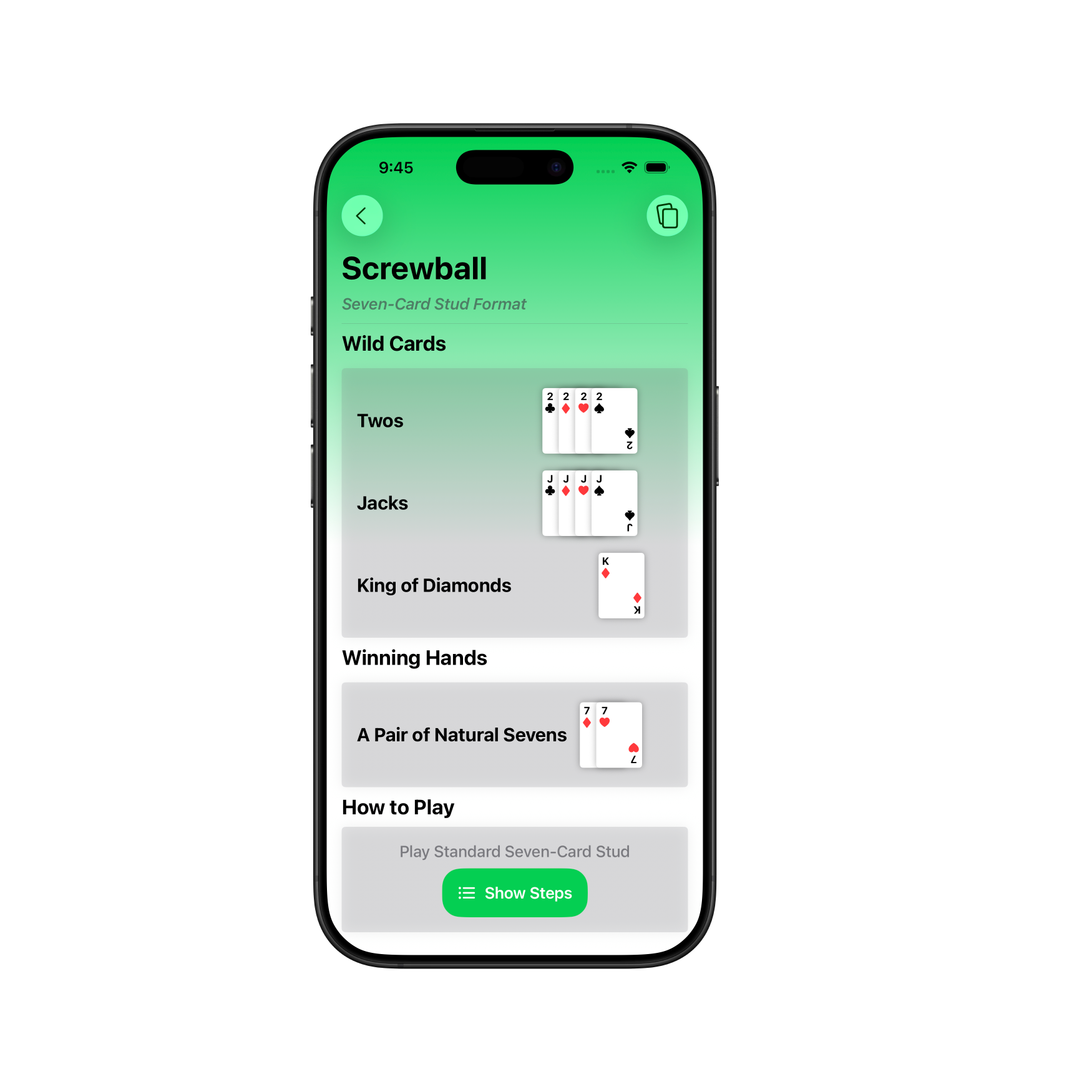
I also got to finally take a crack at implementing VoiceOver support and adding some points to my Accessibility Nutrition Label. My card views worked poorly with VoiceOver prior to some light touch up code. For example, tapping a card depicting the king of hearts would result in VoiceOver only saying “K”, since that’s the only text it can decipher. SwiftUI makes it very easy to fix this with a single modifier.
.accessibilityLabel(
  card.isFaceUp ? Text(card.description) : Text("Face down card")
)
I tested and applied this across other elements, including the hand reference view and the random game picker view.
But adding support not only adds VoiceOver support, but also Voice Control support. Voice Control lets the user control their device with their voice. And because the same code is used across multiple platforms, these benefits apply across iOS, watchOS, and visionOS with no extra effort.
watchOS Double Tap Gestures
I don’t actually have an Apple Watch that supports the double tap gestures, so it wasn’t at top of mind when I originally released the watchOS app. But I was at some point reminded of its existence.
Prior to the release of Cardiac King 1.2, using the gesture would scroll the screen down an arbitrary amount, leaving the user looking at the bottom half of one hand and the top half of another. Not a very optimal user experience.
By adopting a TabView instead of a ScrollView, the view snaps to the nearest hand, meaning one double tap gesture scrolls exactly one hand view. That said, watchOS doesn’t provide a gesture to move backwards, so the carousel will loop back to the top once you double tap at the High Card hand.
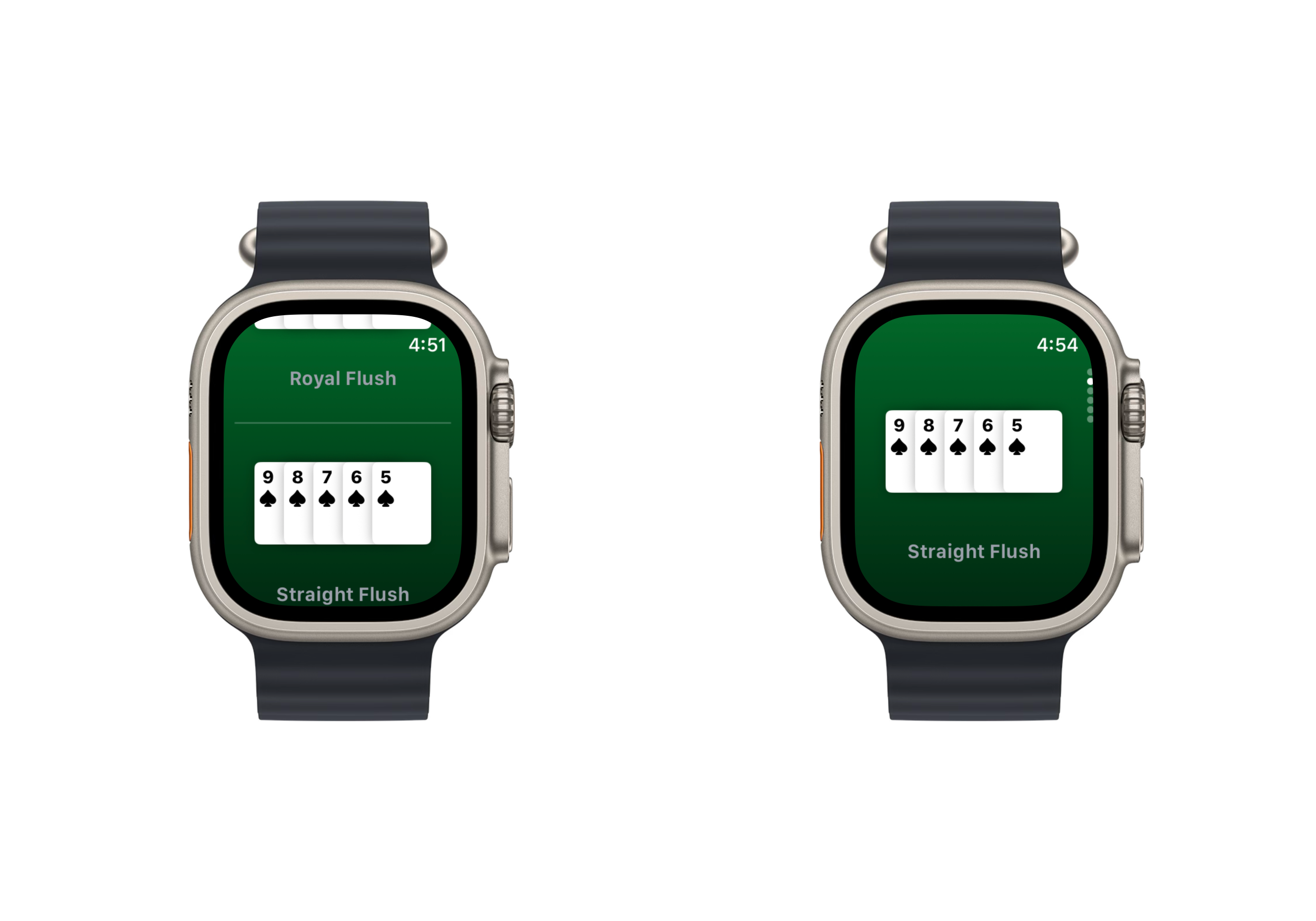
I had some debate whether I should add detailed descriptions for the hands on the watchOS app, like its iOS counterpart. I ultimately decided against it as it didn’t work great with the limited screen space, as well as keeping the interface simple.
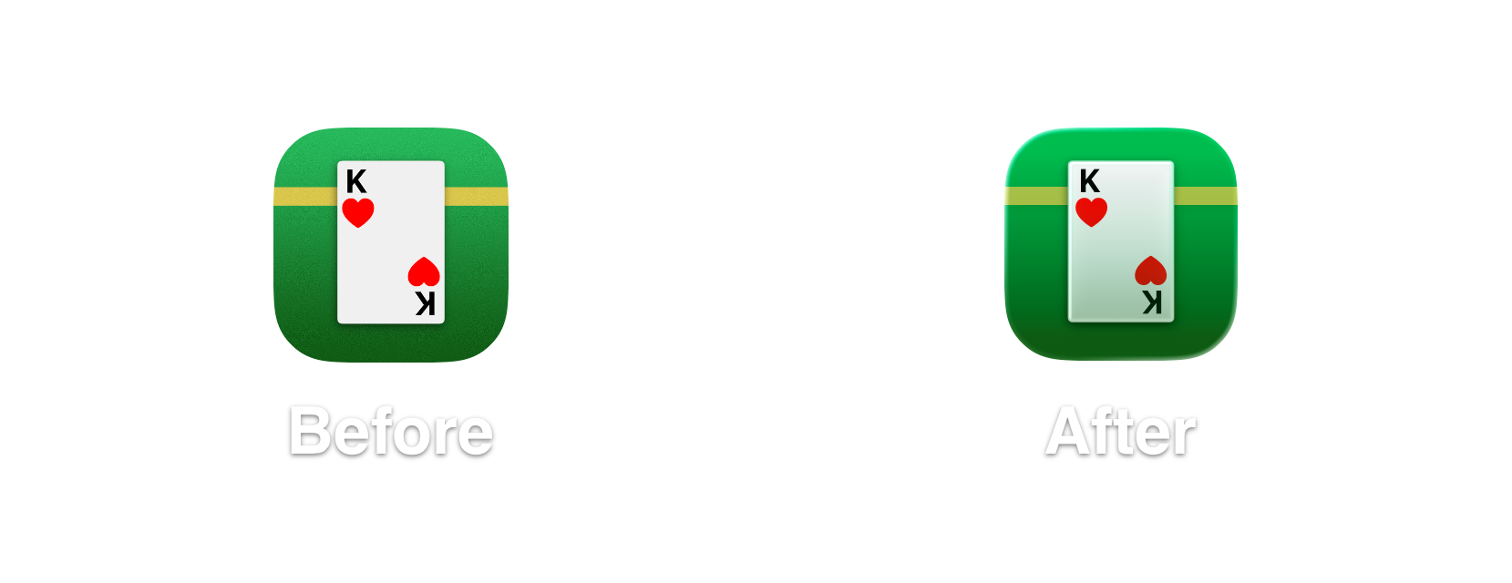
Card Stack Bug Fix
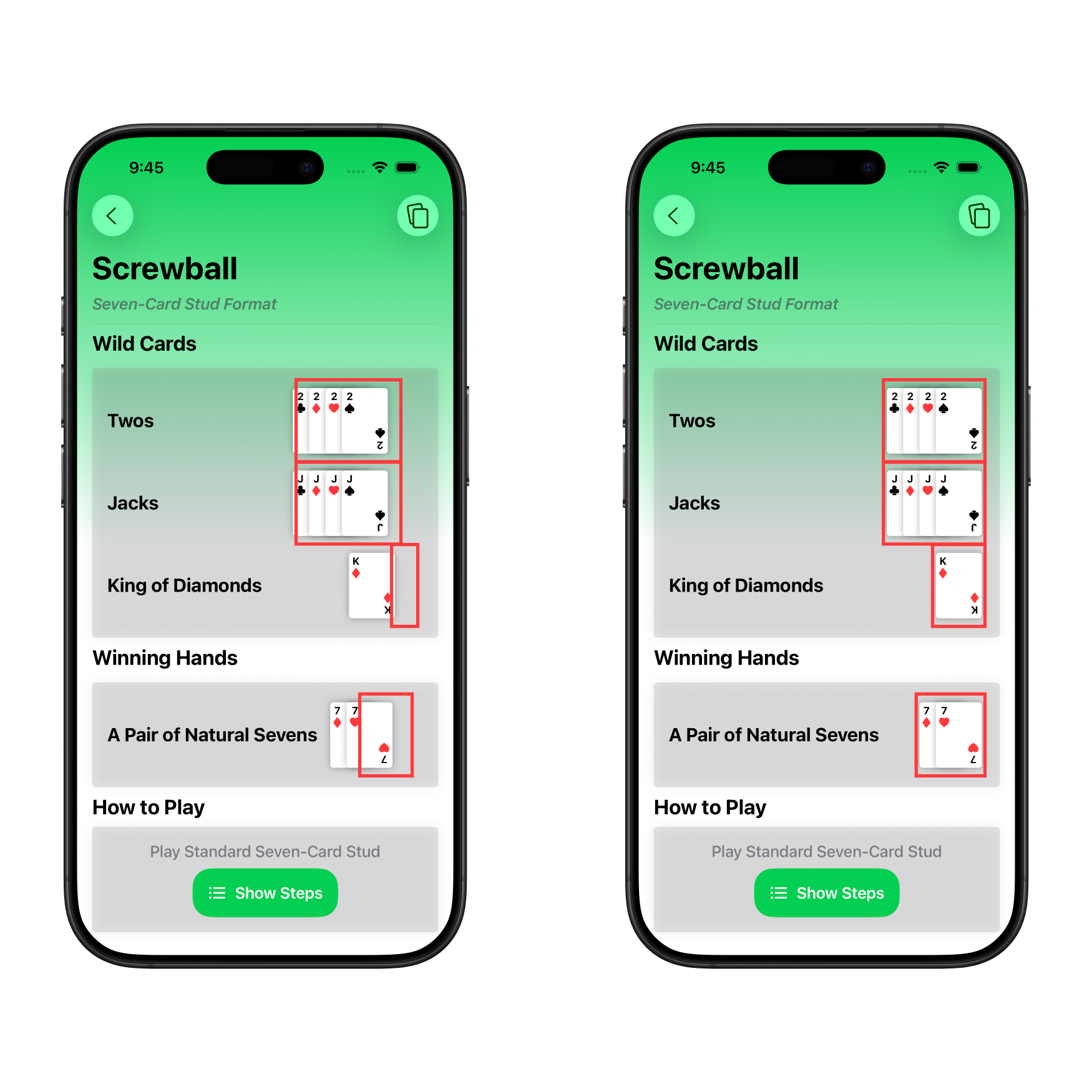
There was a small but nagging issue that has plagued Cardiac King that has finally been remedied. The SwiftUI view that renders many cards in a stack excelled at displaying five cards. This was originally designed for the hand reference view that displays five card hands. But it was adapted for the wild card views later in development. It was a hacky solution but it ultimately got the job done.
Let’s see if you can find the visual bug.
Did you catch it? The bug is that in a game’s detail view, the card stack would display misaligned when card stacks of varying sizes were displayed in a list. Notice how the card stacks aren’t flush against the right side of the screen. Not only does this cause misalignment, but it also gives the text next to the cards less space. The core issue was that I was miscalculating the frame size of the card stack’s view in combination with offsetting cards to give the spread effect. It was designed for five card stacks, but with four cards, there’s some misalignment. With one card, the frame isn’t even close to the card. Below is a comparison before and after the fix, with red outlines annotating where the frame of the views were.
Conclusion
These past few versions have helped me grow immensely as a Swift developer. There’s a lot more that I didn’t cover in this post, including a major refactor of the codebase. Streamlining my development across my apps with SeizosKit has also been very helpful.
As I continue development, I’ll make an effort to share the process behind certain design decisions I make in hopes of providing insight or inspiration to any other developers out there. I highly recommend other developers do the same, as it can be symbiotic for the developer community as a whole.
Cardiac King is available on the Apple App Store.